Skiasharp: Building Gradient ProgressBar for Xamarin.Forms
- 8 min read
I’ve started to create an application to keep track of the progress of the books I am reading (something like goodreads but with a nicer interface). So for the design, I was looking for ideas in dribble and I found some interesting designs like https://dribbble.com/shots/5632432-Book-App-UI/attachments from Carlos Han.
To implement I need to add some controls with gradients as background so I started by creating this “gradient progress bar” using our old friend, Skiasharp.

TLDR;
If you want to use this control in your application, just copy this 187 lines code file: GradientProgressbar.cs into your Xamarin.Forms project and make sure you install SkiaSharp.Views.Forms’s package.
Let’s start the long explanation about this control …
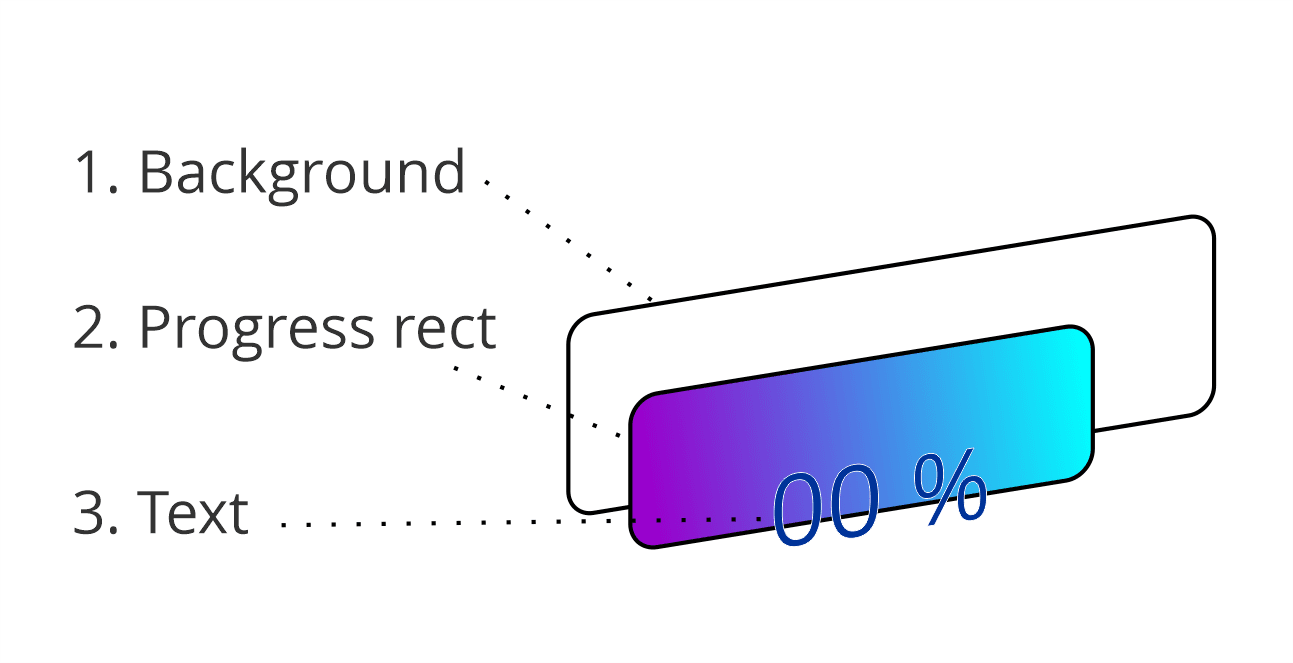
This control is used to display a value between 0 and 1 as a progress bar. Given its minimalist look, it’s something quite simple. There are 3 main parts overlapped, the bottom rectangle that represents the full width of the control, the rectangle that paints the progress and the text indicating the quantity (percentage).

To create our control we must create a class that derives from SKCanvasView and overwrite the OnPaintSurfacemethod. This method receives a parameter , which we will use to get access to the Canvas in order to draw our control, and get control’s information that includes data such as current dimensions.
var info = e.Info; var canvas = e.Surface.Canvas;
float width = (float)Width;
var scale = CanvasSize.Width / width;
It is common to include these lines above, at the beginning of the method to have on hand the information about our surface, the canvas to paint and the scale.
The scale is an important factor because it allows us to transform measurements made in independent units to pixels. Xamarin.Forms handles everything in independent of device’s density units but our Skiasharp canvas does not.
To draw these rectangles with rounded edges we can use a curve or use SKRoundRect class, in my case, I have tried to make it as simple as possible so I am using the last one.
var backgroundBar = new SKRoundRect(new SKRect(0, 0, info.Width, height), cornerRadius, cornerRadius);
var backgroundPaint = new SKPaint { Color = BarBackgroundColor.ToSKColor(), IsAntialias = true};

canvas.DrawRoundRect(backgroundBar, backgroundPaint);
Drawing the background is very simple, the SKRoundRect class needs an SKRect instance to determine its dimensions and the X and Y values for the radius of the rounding of the corners. And our canvas uses the DrawRoundRect method which receives our rectangle and an instance of SKPaint to determine how to paint it, in our case the background color.
If you wonder where the BarBackgroundColorvariable comes from, it is a property of our control that I have defined so that it can be customized, but keep calm we will get to that.
var percentageWidth = (int) Math.Floor(info.Width * percentage);
var progressBar = new SKRoundRect(new SKRect(0, 0, percentageWidth, height), cornerRadius, cornerRadius);
Now, you can see the definition of the rectangle to paint the progress. It is exactly the same as in the previous case, the only special thing is the calculation of the X coordinate that determines its width based on the percentage.
I’m expecting percentage as a value between 0 and 1, so if we want to paint 50% we would use 0.5.
So, if we have a width of 100 (obtained with [info.width](info.width) ) we can calculate the width of our progress bar as: width * width * percentage.
100 * 0.5 = 50
Now, the only complication we could find is to paint the gradient, since it is more complicated than you might imagine, but we will explain it part by part.
using (var paint = new SKPaint(){ IsAntialias = true }) { float x = percentageWidth; float y = info.Height; var rect = new SKRect(0, 0, x, y);
  paint.Shader = SKShader.CreateLinearGradient(new SKPoint(rect.Left, rect.Top),
     new SKPoint(rect.Right, rect.Top),
     new []
     {
         GradientStartColor.ToSKColor(),
          GradientEndColor.ToSKColor()
     },
     new float[] { 0, 1 },

     SKShaderTileMode.Clamp);

  canvas.DrawRoundRect(progressBar, paint);
}
Ok, the first thing we do is create a SKPaint for our rectangle, within a using statement to be able to release it after using it. So in order to get our gradient, which in my case will be a linear gradient, we need to set the Shader of our paint object. The SKShader.CreateLinearGradient method allows us to create our SKShader for a linear gradient, now let’s pay attention to its parameters.
The first two parameters of our CreateLinearGradientmethod, are 2 points that represent from and to (dimesion), our gradient is going to be created, with those values the gradient size and direction are determined. This gradient will be used to paint our rectangle. It is important to understand that these values determine what our gradient looks like, you can use the following image as a reference to understand that concept and how a wider gradient looks different.

In my case, I have opted for the second option, I adjust the gradient to the size of my rectangle to keep colors on edge.
new [] { GradientStartColor.ToSKColor(), GradientEndColor.ToSKColor() },
Talking about colors, the third parameter is an array of colors ( SKColor ) that will make up our gradient, in our case we are only using 2.
The fourth parameter is an float array (gradient stops) that determine our colors position inside our gradient. With zero (0) for the start and one (1) for the end. Depending on the effect you want you can change these values.
The last value is an option within our SKShaderTileMode enumeration. With this value we determine what to do when the gradient does not cover the entire surface we want to paint, can make it fill in a mirror, continue with the color of the edges or repeat the gradient (tiled).
The cherry on the cake: the text that shows the percentage
Now, finally we need to paint the text that shows us the percentage and we will see the considerations of painting something variable in size (text).
var textPaint = new SKPaint {Color = TextColor.ToSKColor(), TextSize = textSize};
var textBounds = new SKRect();

textPaint.MeasureText(text, ref textBounds);

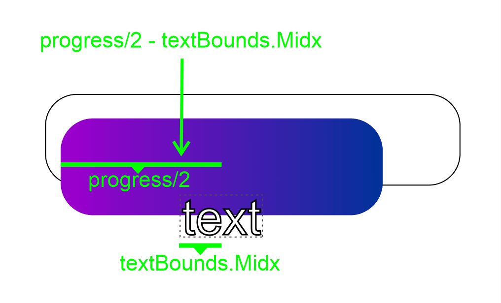
var xText = percentageWidth / 2 - textBounds.MidX;

var yText = info.Height / 2 - textBounds.MidY;

canvas.DrawText(text, xText, yText, textPaint);
The first thing we need is a SKPaint as before, in our case our paint object considers the TextSizeproperty.
The curious thing with the text is that we need to measure the space that our text will occupy in order to position it in our control, for this purpose we will use the MeasureText method of the SKPaint object. Once we know the size it will have, we can determine the starting coordinates of our text depending on where we want it to appear.
var yText = info.Height / 2 - textBounds.MidY;
The start point in Y will be our vertical center, so we use the height, divide it in half and subtract half of the size of the text (MidY).
var xText = percentageWidth / 2 - textBounds.MidX;
In the case of the position on the X axis, I will take the size of our rectangle that represents the progress, calculate half and then subtract half of the size of our text, that will position it at the center.

if (xText < 0) { xText = info.Width / 2 - textBounds.MidX; textPaint.Color = AlternativeTextColor.ToSKColor(); }
In addition, I have placed this condition to validate if the text is larger than the progress bar, things that could happen with very small percentages such as 1% (depending on the width of the control), in that case, I use the full bar size and I give an alternative color to the text.

Time to make it customizable
In order to make this control customizable we must define properties, and given that our intention is that bindings can be applied to those properties, we will define them as BindableProperties. You can review the documentation if you are not familiar with the term. https://docs.microsoft.com/en-us/xamarin/xamarin-forms/xaml/bindable-properties
In the case of our properties, it will be easy to implement them, we just have to make sure that when a property changes ( OnPropertyChanged ) our canvas’ surface is invalidated and our control is forced to re-paint itself.
public static BindableProperty GradientEndColorProperty = BindableProperty.Create(nameof(GradientEndColor), typeof(Color), typeof(GradientProgressBar), Color.Blue, BindingMode.OneWay, validateValue: (_, value) => value != null, propertyChanged: OnPropertyChangedInvalidate);
public Color GradientEndColor
{
    get => (Color)GetValue(GradientEndColorProperty);
    set => SetValue(GradientEndColorProperty, value);
}

private static void OnPropertyChangedInvalidate(BindableObject bindable, object oldvalue, object newvalue)
{
   var control = (GradientProgressBar)bindable;

   if (oldvalue != newvalue)
       control.InvalidateSurface();
}
As you can see, the OnPropertyChangedInvalidate method will be used in all our properties, since we always want to do the same, repaint the control due to a change.
You can review all the properties that I have defined for this control in Github https://github.com/jesulink2514/XamBooksApp/blob/master/XamBooksApp/XamBooksApp/Controls/GradientProgressBar.cs .
You want more?
I will continue creating more UI elements with Skiasharp to complete my design goal. If you have some ideas about more controls that you think they can be created with Skiasharp and would be very useful, do not hesitate and leave us a comment with your idea.
https://github.com/jesulink2514/XamBooksApp